Mobility Matters Extra - The link between rural accessibility and rural deprivation
Key points
There is no clear link between journey times by public transport to key services, and the levels of deprivation experienced in a rural area.
The most deprived rural areas have the best accessibility to key public services.
When tackling rural mobility issues, focus on developing policies that are place-based (e.g. encouraging services to locate in rural areas) as a means of achieving a wider social policy, rather than mobility-based solutions.
Improving connectivity to the most isolated areas may be a socially regressive policy, but there is nuance that must be understood.
Develop close partnerships with the NHS and health groups as a priority.
Rural accessibility planning, for as long as I can remember doing it, has an underlying logic to it that can be traced back to the original report on accessibility by the Cabinet Office in 2003. That is that poor accessibility to key services reduces access to life chances, namely that if it is harder for you to access schools, healthcare, food, and employment, then it will be harder for you to get ahead in life.
In transport, we have often thought of accessibility in terms of travel time to these facilities. Which makes sense. After all, if it takes people longer to travel to services, by that logic it both costs more and it also leaves less time in order to undertake other activities.
There are numerous challenges to thinking about accessibility purely in these terms, but for us transport professionals it is a useful reference point and one over which we can directly control. That is why when measuring deprivation more generally, what is often looked at are many aspects that influence deprivation. The English Indices of Multiple Deprivation, for instance, consider income, employment, education, health, crime, barriers to housing and services (where transport plays a more dominant role), and the living environment.
For several years, the UK Department for Transport has published statistics on Journey Times to key services, down to the level of Lower Super Output Area. And data for 2019 has just been published during this week. Which gave me idea. To what degree does access to services in terms of journey time influence rural deprivation specifically? Or does it.
The analysis I undertook was a relatively simple one. All I simply did was filter all of the Lower Super Output Areas in the Journey Time statistics, and the Indices of Multiple Deprivation by those classified by the Office of National Statistics as being rural in nature. I then plugged the analysis into Excel and QGIS to produce the results and the maps. The proxy that I used for accessibility was the percentage of residents of each Lower Super Output Area who are within 30 minutes journey time by public transport of the following public services:
Primary schools
Secondary schools
Further education (defined as any facility that offers formal education for those aged 16-18 years old)
Doctors
Hospitals
Food stores
Town centres
Employment areas with in excess of 500 employees
You can download the spreadsheet yourself to do your own analysis.
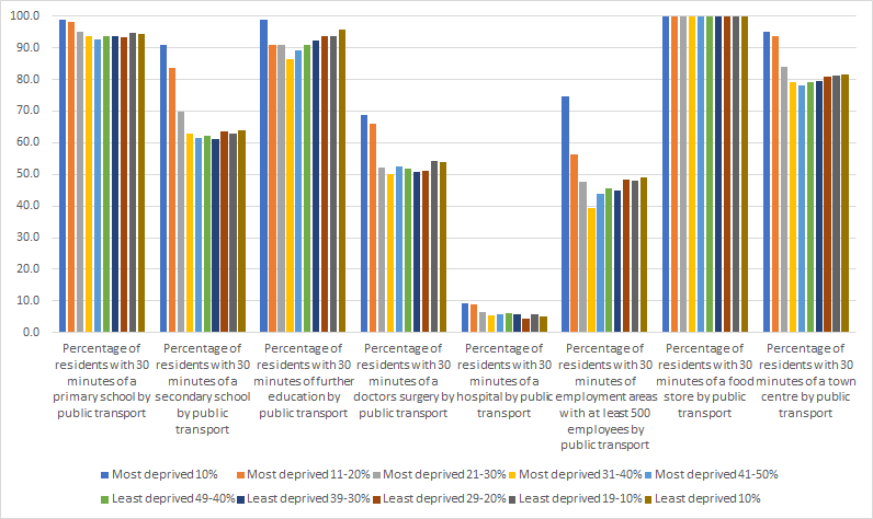
So, what came of it? Lets look first at how accessibility to a range of services differs across the deprivation quintiles, or simply whether or not a Lower Super Output Area is in the top 10% most deprived of all Lower Super Output Areas, top 10-20% etc. You get the picture.
This is immediately counter-intuitive to the way that we consider traditional transport accessibility planning. The most deprived areas in rural areas are the most accessible ones in terms of journey time, whilst the least deprived are generally the least accessible. But there is a notable dip in accessibility for areas that are in the most deprived 31-50%, which seems to be consistent across all of the service types.
Ok now, so lets look at the accessibility of services across all of the different types of rural area - perhaps that is an explainer of this? In this case, we again use the Office for National Statistics’ classification of rural town and fringe, rural town and fringe in a sparse setting, rural village and dispersed, and rural village and disperse in a rural setting.
Perhaps this is not a shock to you, but places on the edge of towns tend to be quite accessible in terms of access to services, whilst rural villages in sparse settings tend to be much more inaccessible. The only service where there is little difference is access to food stores. So this then leads to the next logical step - how deprived, on average, are each of the classifications? For this, we used the average IMD rank, where a lower number indicates that the area is more deprived.
What this shows the relationship is not a linear one. Areas that are on the edge of towns and in rural villages generally tend to be less deprived than areas that are sparse. The final question that needs answering is whether or not there is a relationship between the deprivation and journey times to services. For this, I have taken the average percentage of people within 30 minutes journey time of the services, and the average IMD rank, and tested to see whether there is a relationship using a multiple regression analysis for the following:
Education (primary and secondary schools)
Healthcare (doctors and hospitals)
Employment
Retail (food stores and town centres)
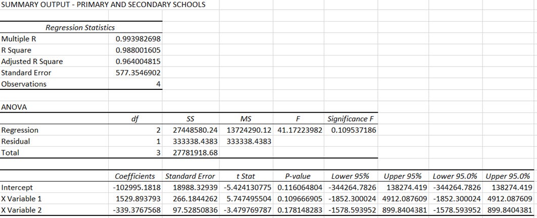
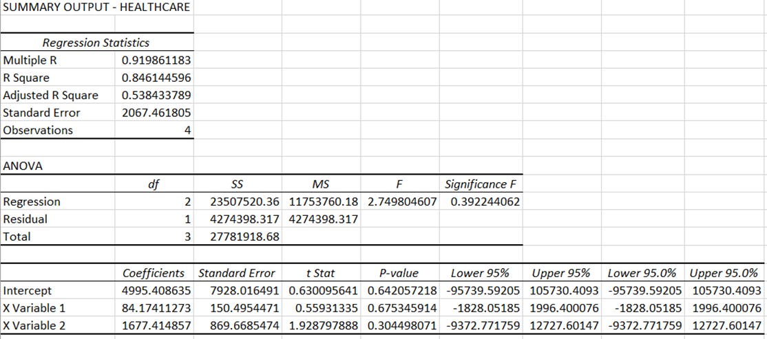
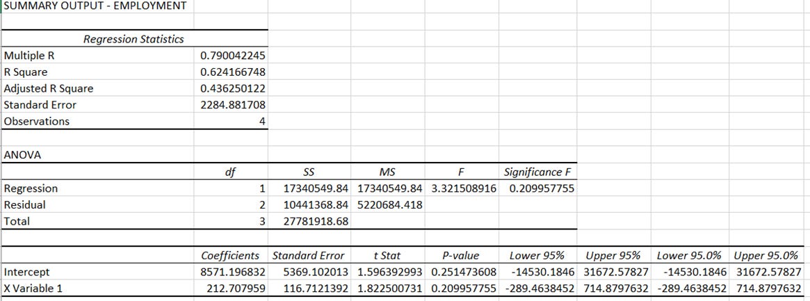
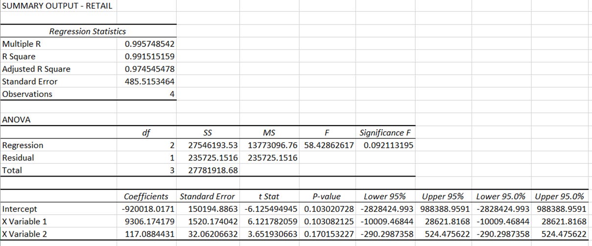
For each, I will be using a 95% confidence level in a standard regression analysis in Excel. The results are shown here.
The results of this analysis are pretty conclusive. Changes in the rank on the IMD are not explained by any of the variables representing the average access time to services to a level that is statistically significant. In other words, it seems that the rank on the IMD for each of the rural classifications is not affected by its average accessibility in terms of journey time.
Or even more simply, how deprived a rural area is does not appear to be explained by how accessible it is.
I always find that it is useful to visualise these things to see whether there are any areas of interest, and whether the visual explains the variance or lack of it. Time to fire up QGIS and to produce some pretty maps. Lets start off with where the most deprived rural areas can be found according to the IMD.
This map shows the significant variation in deprivation across rural areas in England. There are notable concentrations of deprivation in rural areas around the South West peninsula, Lincolnshire and the Wash, parts of the Kent coast, and Northumberland. But the affluence of the rural areas of Central and Southern England really wreaks havoc on the regression analysis, and challenges our own assumptions. I did not have the time to do this analysis, but I am willing to wager that if car ownership levels were overlaid, many of the more affluent areas would see in excess of 50% of households having 2 cars.


For primary schools there is generally good accessibility across the majority of rural areas. Which is no shock, considering that a significant number of even the smaller villages have a primary school within them. For secondary schools the picture is more of a mixed one, with a number of areas of very poor accessibility to secondary schools.
For further education, the picture is much better, with a large proportion of rural areas having at least 75% of the population within 30 minutes journey time of a further education facility. I am unsure as to the reason for this from this work, but potential explanations could be rural campuses for some establishments, agricultural colleges, and maybe private schools that offer a more general post-16 education.

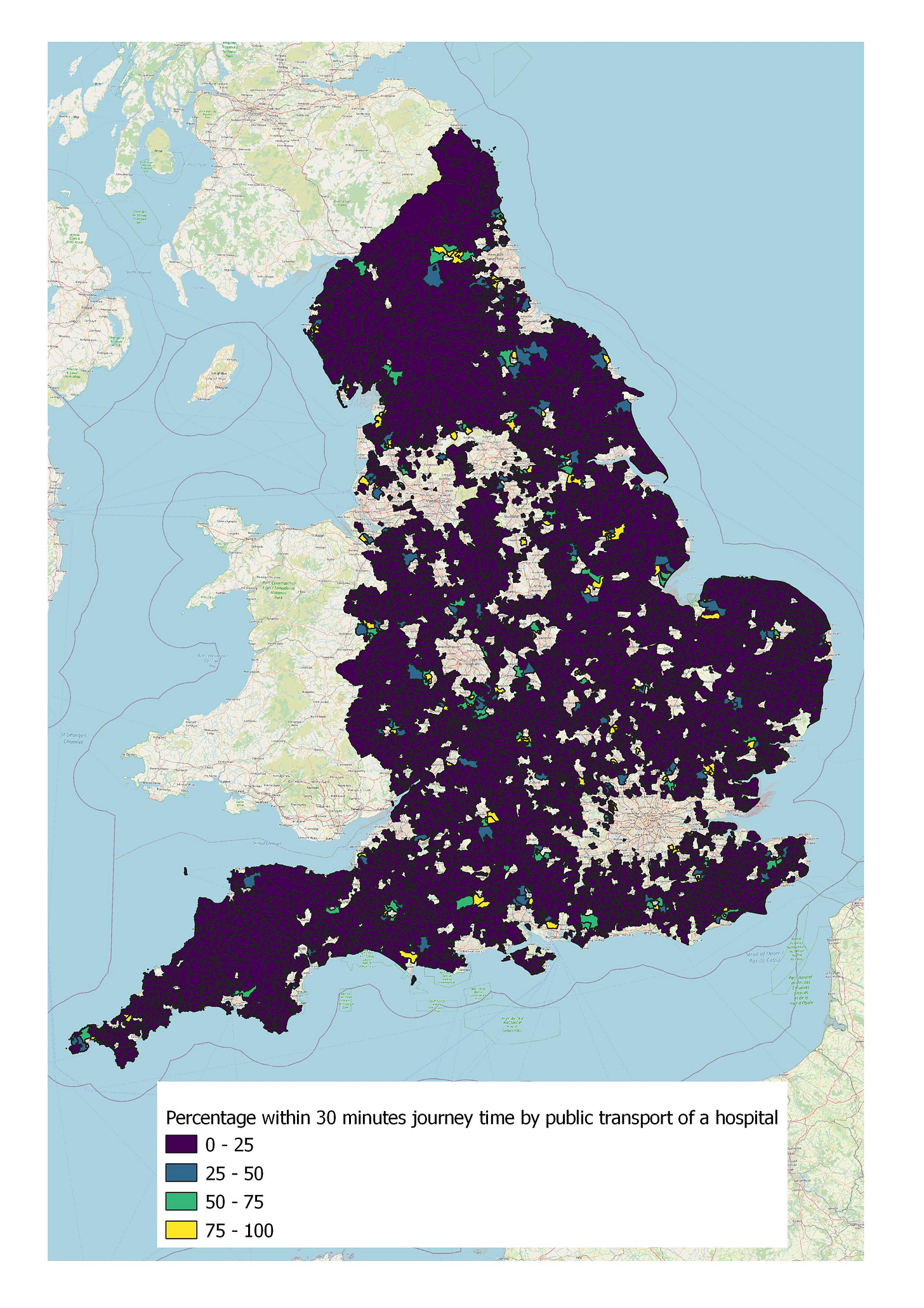
Healthcare is generally inaccessible to rural residents. The majority of rural residents are over 30 minutes journey time by public transport away from a doctors surgery, and apart from some very isolated examples, almost everyone is over 30 minutes away from a hospital.

If you live in a rural area and you are trying to get to a major employment site, chances are you are out of luck. Whilst there is a lot of variance in Central England, most of the countryside in the rest of the country has poor accessibility to major employment areas by public transport.


As for food stores, it seems that every rural area has one, or at least one within half a hour by public transport. As for getting to a town centre, it is very much a mixed bag for everyone.
Just reviewing this data gives out several possible explanations, and certainly some further hypotheses to test. The most notable of which is that it would seem that accessibility has no or a weak link on the deprivation experienced in rural areas. This is because either the accessibility picture in terms of access to public services in rural areas is mixed with no clear correlation between accessibility and deprivation, or everywhere is inaccessible to that particular service.
In some ways this is not surprising. The Indices of Multiple Deprivation cover a wide variety of deprivation factors, of which accessiblity to services is part of one measure. So it is expected that the other factors combined are likely to play more of a role in determining whether an area is deprived.
It is also worthwhile considering what the evidence presented here is not saying. It is not saying that poor accessibility is not an issue worth tackling in rural areas. This evidence shows that many areas do have poor accessibility, but that tackling social exclusion is not just a case of making buses run more directly, or creating service hubs in communities. Places need to understand what is driving deprivation in these areas, and develop solutions to tackle these drivers that may or may not include a transport element.
To take an example, if one rural area was identified as deprived due to poor education levels, you may find that simply putting on a bus to the nearest good further education college may not be sufficient. An alternative approach could be to invest in school facilities and the quality of teaching in that area, with transport investment supporting children’s ability to learn and improving their learning outcomes. For example, by encouraging more people to walk and cycle to school. Your transport policy is then not so much a movement policy, as it is a place policy.
Additionally, and this needs to be stressed, just because an area is identified as performing well on the Indices of Multiple Deprivation, it does not mean that there is no deprivation in that area. Hidden deprivation is cited by some as particularly endemic in rural areas, notably for agricultural workers on lower wages (though I have yet to see good quality evidence to support this claim). But just because one house is a mansion, doesn’t mean that another on the next street will be the same.
This analysis is preliminary at this stage, and just consists of taking two datasets and mixing them together. But it shows that the rural accessibility challenge is not a transport problem. It is a place-based problem to which there is a transport element, and simply putting on more services to nearnby public services may not be a sufficient policy response. Social and economic problems need transport to support them in tackling it, but transport cannot solve them. I intend to return to these datasets in due course to find out more about the rural accessibility challenges facing us a policy makers.
Key policy recommendations
When attempting to tackle rural accessibility issues, focus on policies and solutions that are place-based and not mobility-based. For example, look at locating services in communities and not bringing communities to services.
Investing in new connections to the most rural places in England and subsidising new services runs a higher risk of those policies being more socially regressive (i.e. putting on public transport to those who are well off), but these options need to be tested for their social impact as there is naunce in the accessibility issues of isolated communities.
The priority partnership that policy makers must develop is with the NHS and local health groups, as access to healthcare facilities is generally very poor across all rural areas.


